Pages

Showing posts with label uni. Show all posts

Tuesday, 10 January 2012

Art Organizations

As I am doing my client project for Prime Cuts, I thought I'd look at some art organization websites to get some inspiration and ideas.

Shape


Arts Council


Institute of Contemporary Arts


Paddington Arts

Sunday, 20 November 2011

Research - Interactivity=Sales

Interactivity = Sales

  • If you can draw your reader’s eye and successfully get them to do something, you are on your way to winning new customers.
  • Be interactive, because when your customers feel compelled to do something, they are one step closer to buying!


"Interactivity=Sales" [online]
http://www.thunderdata.com/thunder_bits/importance_of_interactive_websites.html
[Accessed 20 October 2011]

Tuesday, 15 November 2011

Research Project Topic

I haven't said anything about the research project here yet :/

So I had several ideas at the beginning, and they were all based on the idea of Interactivity.
I looked at some articles on the internet like this one is about being interactive on commercial websites in order to gain more customers. And this one is about the importance of interactivity in web design.
I came up with this question after considering different topics:
How interactive websites help commercial companies build up a brand compare to ordinary websites?
And after talking to my tutor and looking at some more articles on this journal, I've moderated the question to:
Does different interactivity on a website affect users’ perception of a brand?
I've already submitted the Research Top Form and now in the process of reading articles and books. Will be updated soon!

Thursday, 20 October 2011

Simulated Client - Final Design


So I made it. But I think it looks plain and too simple. So I go and searched for some more cancer-fund websites and then I had the idea of adding some colours into the paragraphs from this website- http://www.cancer-fund.org/en/index.html


I like how the colours in the paragraphs highlight some key words and makes the page less dull.

So here's the improved version-

Saturday, 15 October 2011

Simulated Client - Wireframe & Mock up

Since my idea is just a simple website, my wireframe isn't very interesting. But it showcase how my original design looks like.


So here's a mock up page for my design so far. 4 links at the bottom to go to other pages.

Tuesday, 11 October 2011

Simulated Client - Ideas

I've decided to do a simple website for the simulated client project for NTU's Alumni Association specified in the Cancer Research area. I am thinking of doing a 5 pages website with only very few buttons showing the Cancer Research information on each page, which this website could be used to promote the Cancer Research Project for people to know more about this project and donate to help.

I am looking at some existing cancer-based websites for ideas.
I realized most of them uses simple font and styling in their website to make sure they look professional and serious. They have clear information page and details of their work.

So I will keep my website simple and fresh, so the audience would understand what the website is about right away.

Sunday, 9 October 2011

Interactive Music Videos

I've always loved watching music videos. And as I find interactive music videos very interesting, why not use this topic for my Context 3 assignment.

Here are some inspirations:
10 interactive music videos powered by flash
and this one I posted already

I really like the 'I've seen enough' and 'Bell' video, but I am thinking more of the 'Keep Your Head Up' type video, where you have choices to choose from and form your own story.

Or like in the 'mirror' video, you upload a photo of yourself or you connect to facebook/twitter, so it takes some of your personal information from you to put into the video, so it becomes your own 'personalised' video.


I need to start writing something soon.

Wednesday, 25 May 2011

Group Client Project - Javascript for controlling font size

As we realised that many software companies may have smaller computer monitors, I got the job to look up a Javascript which could control the font size in a page.
So here's the Javascript for changing the font size in the webpage.

http://www.white-hat-web-design.co.uk/articles/js-fontsize.php

I've tried it in one of the page we've got and it worked.


I've also created two icons for the changing buttons. (transparent background with white image so it doesn't show:p)

Tuesday, 24 May 2011

Group Client Project - more fonts

As the font we decided to use turned out was a bit "fade" to see, we are looking for a font that looks similar to Caviar Dreams but also clear in a small size. So here's some I looked at.

1) Droid Sans - looks clear in 12 and 14px but it's not all that Caviar Dreams

(click to enlarge)


2) Arimo - looks less clear in 12px but quite good in 14px

(click to enlarge)


3) Quattrocento Sans - 12px doesn't look as good as in 14px but better than the second one

(click to enlarge)

4)
Raleway
- most similar to Caivar Dream but not very clear even in 14px

(click to enlarge)

5) Nobile - look good both in 12 and 14px

(click to enlarge)

6) Ubuntu - clear in 12 and 14px too but itsn't very Caviar Dreams

(click to enlarge)

I personally prefer the 5th one-Nobile, I think it looks modern and professional, yet very clear in a small size. I am going to discuss with my groupmate and see what they think.

Thursday, 19 May 2011

Group Client Project - updates


This is the homepage of the website so far.

The navigation and gallery jQuery are working, the pages are linked together.
As each member of our group have done different pages separetely, we are now working on putting the pages together with the same CSS style but the basic structure is done. We still have quite a lot to tidy up and a few jQuery codes needed to be add in but I think we've worked quite well so far as a group.

Monday, 16 May 2011

Group Client Project - Accordion

As there are so much information in the website we need to include, we need some jQuery accordion to hide some of the content in a page so the content and the page will be neater and clearer.

This is the accordion we are going to use- jQuery Common Accordion - Horizontal and Vertical


Demo

Thursday, 12 May 2011

Group Client Project - Product Icons

These are the original icons for the products.


I've re-designed them to make them look moderner and more professional.

Wednesday, 11 May 2011

Group Client Project - front page pictures

I've been working on the pictures that are going to be in the gallery box in the front page, like the one in the Windows homepage with buttons that can slide through the products and linked to the download page.


Each one of these pictures are for each one of the five products in AJC Soft.
They need further editing as they look a bit dull at the moment and we need to try to put them into the actual HTML5 to see if they fit and also ask the client's opinion first and then I could improve the quality of the pictures.

Tuesday, 10 May 2011

Group Client Project - jQuery gallery

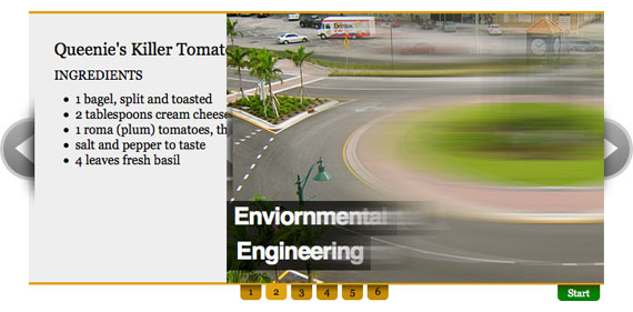
I am looking at some jQuery galleries for the front page gallery.

1)View Demo


script

We need something like this, with a description and buttons for users to click through the pictures.

2) View Demo


script

I think this is just what we need, with clear arrows and number of slides. Description with links too.

3) Demo + Script


I like this one, simple and professional.

4) Demo + Script


This is similar to the one above, simple and professional. An I think this looks even moderner.

5) Demo + Script


I think our group had came across this one and thought this would be a good one to use. I like it. It's like the two above combined.

Thursday, 5 May 2011

Group Client Project - further mock ups

After meeting up with our group, we've came up with an improved version mock up. I am glad that it's based on my first mock up as my groupmate liked my use of the colours.

This is the improved version mockup for the homepage I made.


This is basically how the website is going to look like with these colours and layout and this is the actual size too. The only thing isn't right is the font, we've decided to use this Caviar Dreams font.

So now we are going to work on the actual HTML5 and CSS3 and putting in some JQuery codes and the more complicated product pages, still a lot to do, more to come!

Monday, 2 May 2011

Group Client Project - Lavalamp menu

So finally, we've decided not to use a drop down menu in the navigation bar, as it looks a little bit messy when it drops down. We've decided to use the Lavalamp Menu in the navigation bar, because it's neat and looks professional.

Here's the one we've chose to use - Lavalamp Menu

Demo

Thursday, 28 April 2011

Group Client Project - Mock up

Working on some mock ups at the moment. This is the first mock up draft of the homepage.
We've chosen this color template as our color theme as we all agreed to the colors of blues and greys.


More to come....

Tuesday, 26 April 2011

Group Client Project - Structure

This took me a long time.
The basic structure of the existing website.
Since our client had updated the website recently, there are some changes in different sections. They've added a forum and useful article in the website, but the website now is much clearer and neater than the previous one which makes us easier to build a new one.

(click to enlarge)

It's probably a little bit messy, hope everyone at least understands the basic structures.

Sunday, 17 April 2011

Group Client Project - Fonts

I'm looking at possible fonts which we could use in our website.
I think the most important thing about the font in a software website is it should look professional, reliable and easy to read.

1) PT Serif

(click to enlarge)

2) Vollkorn

(click to enlarge)

3) Molengo

 
(click to enlarge)