Pages

Tuesday 30 November 2010

Web 2.0

From the article 25 Examples of Web 2.0 and Traditional Design Rules Coming Together, I've chosen this Viget Inspire website as I found it inspiring. It is a blog-based website from the designers of the web company Viget Labs.


I really like the colours and the watercolour theme and feel. It feels calm when I was looking through the site.
I like the header a lot, I think the word 'Inspire' associated with the rising sun worked really well. And I think it's clever that they have their name and logo look like the sun coming up, looks like its telling you there are inspiring things behind the website, you just have to dig them out.
The font looks professional and it works great with the overall design.
I love their avatar, I didn't even realized there is an avatar on each post until the article pointed out. They are so nicely done they don't distract you from reading the posts at all which, many other avatars do.
I find the boxes in the sidebar really cool, the design is unique and contemporary.

It has a lot of information on this website but they are very clear and the content is not just about their work or company, but they also "write about design news, trends, techniques, buildout, inspiration, CSS, and our project" from a more general angle.
The content in the sidebar is rich and very useful. The information is also really well organized.

The site hasn't been changed since 2009, I think it's because the website works well and it's probably representative for them. It looks professional yet interesting for people to look at.

I would very much like to create my own avatar as clever as theirs. And I wish I could make a website which is clear and easy to use but yet content-driven too.

Monday 29 November 2010

Adit Shukla

I just thought this web designer Adit Shukla's portfolio website is so wise that I need to put it up here.


I find the header and the sidebar work together really well and the idea is really clever. I think the choice of colour is quite daring but it works out quite well. Although this is a simple website with not much content, the design of the website is really clever.

Wednesday 24 November 2010

Photo Donuts

So I found this website called Photo Donuts from my previous art teacher's twitter (That's when I feel twitter and my network useful).

It is a photography website with different photographers presenting everyday. They are different in style and they are from all over the world. It has some inspiring photos and I think the website itself is quite nice too. It has a clear layout and instructions, I like the home page where its like a portfolio page with the daily photographers photos.

Friday 19 November 2010

Colour in Design

I think the colours of this logo indicate the elements of a cup of coffee.
Blue for water, Brown and Black for coffee beans.
As I thought of Cafe Nero I thought of Starbucks too, so I did an exchange of colours of these two logos.

The Original Logo
reminds me of trees...
christmas tree?
snow on a tree? :p
feels like it's a scary little coffee shop


I think they uses green is because they wanted to show their coffee beans are organic. I don't know about the mermaid, maybe it represents the sea? but what's the sea to do with coffee..........who knows!

The Original Logo
Don't know why but it looks like it's a dairy company...
same reason, it's the colours of cooffee beans, water and milk
This actually reminds me of a cup of latte...

Wednesday 17 November 2010

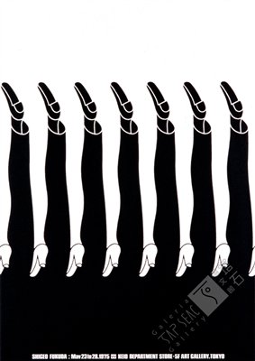
Shigeo Fukuda

When I looked at the Design Is History website, Shigeo Fukuda immediately caught my attention - a graphic designer which I had came across briefly before.

 
1979 Fukuda Illustration Exhibition Keio Gallery, Tokyo

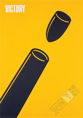
Shigeo Fukuda is a Japanese graphic designer, famous for poster designing. His work is simple but yet effective. He then created illusion illustrations which I found really interesting too. His works are rational reflective rather than commercial, like his most famous work Victory 1945, an ironic illustration of the war.

 
1975 Victory Poland Poster Museum

He is good at communication therefore had created impacted works using simple illustrations. A lot of his works look simple and easy to understand but yet have complex meanings in them. His works shown concerns about social, cultural and environmental issues if the time. I like his works as they are inspiring and his style of design is so unique and thought provoking.

“I believe that in design, 30 percent dignity, 20 percent beauty and 50 percent absurdity are necessary"

"In terms of my graphic design, I feel visual communication is the most important element.

by Shigeo Fukuda