Pages

Sunday 20 November 2011

Research - Interactivity=Sales

Interactivity = Sales

  • If you can draw your reader’s eye and successfully get them to do something, you are on your way to winning new customers.
  • Be interactive, because when your customers feel compelled to do something, they are one step closer to buying!


"Interactivity=Sales" [online]
http://www.thunderdata.com/thunder_bits/importance_of_interactive_websites.html
[Accessed 20 October 2011]

Friday 18 November 2011

Research - Importance of Interactivity in Web Deign

Importance of Interactivity in Web Deign

  • Interactivity has increasingly become one of the central themes of web design.
  • A truly successful website is able to encourage any level of interaction.
  • A good single user interaction should be able to provide the user with an engaging element on the website’s content.
  • A positive interaction will encourage a good relationship between the user and the content.


“Importance of Interactivity in Web Design” [online]
http://www.nethu.org/2011/07/importance-of-interactivity-in-web-design/
[Accessed 20 October 2011]

Tuesday 15 November 2011

Research Project Topic

I haven't said anything about the research project here yet :/

So I had several ideas at the beginning, and they were all based on the idea of Interactivity.
I looked at some articles on the internet like this one is about being interactive on commercial websites in order to gain more customers. And this one is about the importance of interactivity in web design.
I came up with this question after considering different topics:
How interactive websites help commercial companies build up a brand compare to ordinary websites?
And after talking to my tutor and looking at some more articles on this journal, I've moderated the question to:
Does different interactivity on a website affect users’ perception of a brand?
I've already submitted the Research Top Form and now in the process of reading articles and books. Will be updated soon!

Monday 14 November 2011

Touch Screen Electric Guitar


So I came across this touch screen electric guitars and thought they are really cool to share - The Misa Digital Guitar


So you can make a whole lot of different sounds from this guitar just like an electric piano but with a guitar. Creating special sound effect doesn't seem so hard now:)

And with the technology improving everyday, I believe daily object with the need of interactivity will become bigger and bigger.

Monday 31 October 2011

Music Video - Even Now by Sung Si Kyung


Hong Kong!
Some how it made Hong Kong looked so beautiful. I feel unfamiliar with my hometown...

Anyway, I like how the way this music video was shoot.

Thursday 20 October 2011

Simulated Client - Final Design


So I made it. But I think it looks plain and too simple. So I go and searched for some more cancer-fund websites and then I had the idea of adding some colours into the paragraphs from this website- http://www.cancer-fund.org/en/index.html


I like how the colours in the paragraphs highlight some key words and makes the page less dull.

So here's the improved version-

Saturday 15 October 2011

Simulated Client - Wireframe & Mock up

Since my idea is just a simple website, my wireframe isn't very interesting. But it showcase how my original design looks like.


So here's a mock up page for my design so far. 4 links at the bottom to go to other pages.

Tuesday 11 October 2011

Simulated Client - Ideas

I've decided to do a simple website for the simulated client project for NTU's Alumni Association specified in the Cancer Research area. I am thinking of doing a 5 pages website with only very few buttons showing the Cancer Research information on each page, which this website could be used to promote the Cancer Research Project for people to know more about this project and donate to help.

I am looking at some existing cancer-based websites for ideas.
I realized most of them uses simple font and styling in their website to make sure they look professional and serious. They have clear information page and details of their work.

So I will keep my website simple and fresh, so the audience would understand what the website is about right away.

Monday 10 October 2011

Music Video - Hug Me Once by Girl's Day


This is not exactly an interactive video, but it's fun as a music video.
You could click on some buttons but with the 'Game' some buttons are fake. I like the idea that it was filmed like a video game and you have different endings too.

I bet those guys like it (lol)

Sunday 9 October 2011

Interactive Music Videos

I've always loved watching music videos. And as I find interactive music videos very interesting, why not use this topic for my Context 3 assignment.

Here are some inspirations:
10 interactive music videos powered by flash
and this one I posted already

I really like the 'I've seen enough' and 'Bell' video, but I am thinking more of the 'Keep Your Head Up' type video, where you have choices to choose from and form your own story.

Or like in the 'mirror' video, you upload a photo of yourself or you connect to facebook/twitter, so it takes some of your personal information from you to put into the video, so it becomes your own 'personalised' video.


I need to start writing something soon.

Wednesday 25 May 2011

Group Client Project - Javascript for controlling font size

As we realised that many software companies may have smaller computer monitors, I got the job to look up a Javascript which could control the font size in a page.
So here's the Javascript for changing the font size in the webpage.

http://www.white-hat-web-design.co.uk/articles/js-fontsize.php

I've tried it in one of the page we've got and it worked.


I've also created two icons for the changing buttons. (transparent background with white image so it doesn't show:p)

Tuesday 24 May 2011

Group Client Project - more fonts

As the font we decided to use turned out was a bit "fade" to see, we are looking for a font that looks similar to Caviar Dreams but also clear in a small size. So here's some I looked at.

1) Droid Sans - looks clear in 12 and 14px but it's not all that Caviar Dreams

(click to enlarge)


2) Arimo - looks less clear in 12px but quite good in 14px

(click to enlarge)


3) Quattrocento Sans - 12px doesn't look as good as in 14px but better than the second one

(click to enlarge)

4)
Raleway
- most similar to Caivar Dream but not very clear even in 14px

(click to enlarge)

5) Nobile - look good both in 12 and 14px

(click to enlarge)

6) Ubuntu - clear in 12 and 14px too but itsn't very Caviar Dreams

(click to enlarge)

I personally prefer the 5th one-Nobile, I think it looks modern and professional, yet very clear in a small size. I am going to discuss with my groupmate and see what they think.

Monday 23 May 2011

Music Video - Love Song by BIGBANG

I can't believe I haven't posted it here. It's a music video from the famous Korean pop group BIGBANG.


One shot! Really like the angles and the zoom in and outs.
I love it's in black and white too, it adds a sorrow feeling to the video.
and...how could you stand under that smoke and dance!? I also would like to know how many times they've rehearsed before the actual shooting to get that one shot done! You know...there's a car explosion at the end where you need to get it right for only one time!

Apparently the production costs $200,000 USD and they have been filming it for 4 days using "Skycam (overhead cameras on wires)" and "4 point wire cam" (not sure if those are official names:p)

Just in case, this is the Making of the video here for you.

Saturday 21 May 2011

Cars 2 trailer recreated with LEGO


It's a frame-by-frame recreation of the original Cars 2 trailer with LEGO bricks.

Isn't this cool. I especially like the explosion part! :)

Thursday 19 May 2011

Group Client Project - updates


This is the homepage of the website so far.

The navigation and gallery jQuery are working, the pages are linked together.
As each member of our group have done different pages separetely, we are now working on putting the pages together with the same CSS style but the basic structure is done. We still have quite a lot to tidy up and a few jQuery codes needed to be add in but I think we've worked quite well so far as a group.

Monday 16 May 2011

Group Client Project - Accordion

As there are so much information in the website we need to include, we need some jQuery accordion to hide some of the content in a page so the content and the page will be neater and clearer.

This is the accordion we are going to use- jQuery Common Accordion - Horizontal and Vertical


Demo

Thursday 12 May 2011

Group Client Project - Product Icons

These are the original icons for the products.


I've re-designed them to make them look moderner and more professional.

Wednesday 11 May 2011

Group Client Project - front page pictures

I've been working on the pictures that are going to be in the gallery box in the front page, like the one in the Windows homepage with buttons that can slide through the products and linked to the download page.


Each one of these pictures are for each one of the five products in AJC Soft.
They need further editing as they look a bit dull at the moment and we need to try to put them into the actual HTML5 to see if they fit and also ask the client's opinion first and then I could improve the quality of the pictures.

Tuesday 10 May 2011

Group Client Project - jQuery gallery

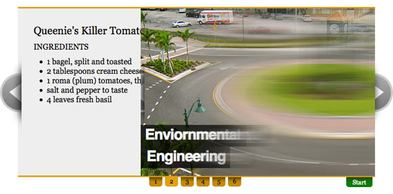
I am looking at some jQuery galleries for the front page gallery.

1)View Demo


script

We need something like this, with a description and buttons for users to click through the pictures.

2) View Demo


script

I think this is just what we need, with clear arrows and number of slides. Description with links too.

3) Demo + Script


I like this one, simple and professional.

4) Demo + Script


This is similar to the one above, simple and professional. An I think this looks even moderner.

5) Demo + Script


I think our group had came across this one and thought this would be a good one to use. I like it. It's like the two above combined.

Thursday 5 May 2011

Group Client Project - further mock ups

After meeting up with our group, we've came up with an improved version mock up. I am glad that it's based on my first mock up as my groupmate liked my use of the colours.

This is the improved version mockup for the homepage I made.


This is basically how the website is going to look like with these colours and layout and this is the actual size too. The only thing isn't right is the font, we've decided to use this Caviar Dreams font.

So now we are going to work on the actual HTML5 and CSS3 and putting in some JQuery codes and the more complicated product pages, still a lot to do, more to come!

Monday 2 May 2011

Group Client Project - Lavalamp menu

So finally, we've decided not to use a drop down menu in the navigation bar, as it looks a little bit messy when it drops down. We've decided to use the Lavalamp Menu in the navigation bar, because it's neat and looks professional.

Here's the one we've chose to use - Lavalamp Menu

Demo

Thursday 28 April 2011

Group Client Project - Mock up

Working on some mock ups at the moment. This is the first mock up draft of the homepage.
We've chosen this color template as our color theme as we all agreed to the colors of blues and greys.


More to come....

Tuesday 26 April 2011

Group Client Project - Structure

This took me a long time.
The basic structure of the existing website.
Since our client had updated the website recently, there are some changes in different sections. They've added a forum and useful article in the website, but the website now is much clearer and neater than the previous one which makes us easier to build a new one.

(click to enlarge)

It's probably a little bit messy, hope everyone at least understands the basic structures.

Monday 25 April 2011

Group Client Project - Drop down menu

Looking at some drop down menus for the website.

I like this one:  http://www.webdesigndev.com/web-development/create-the-fanciest-dropdown-menu-you-ever-saw


DEMO

but it's probably a little too complicated.


This one looks quite good too : http://www.clarklab.net/blog/posts/animated-drop-down-menu-with-jquery/

DEMO

I like how the words go bold and bigger when the mouse move over.


I think this one is probably the most suitable for our website : http://javascript-array.com/scripts/multi_level_drop_down_menu/?st


I like how the menu is kind of faded in and out. It's clear and looks professional too.

Sunday 17 April 2011

Group Client Project - Fonts

I'm looking at possible fonts which we could use in our website.
I think the most important thing about the font in a software website is it should look professional, reliable and easy to read.

1) PT Serif

(click to enlarge)

2) Vollkorn

(click to enlarge)

3) Molengo

 
(click to enlarge)

Group Client Project - Colour Swatches

Some colour palettes I think are possibly suitable for our website.

1) http://www.colourlovers.com/palette/92095/Giant_Goldfish


2) http://www.colourlovers.com/palette/381446/Before_All_Fades


3) http://www.colourlovers.com/palette/1490128/spirited_away


4) http://www.colourlovers.com/palette/2204/Retro_blue


5) http://www.colourlovers.com/palette/14664/son_o-prime


I've chosen mostly grey-blue colours as I think it looks professional yet comfortable.

Saturday 16 April 2011

Group Client Project - inspiring websites

Our client is a software company called AJC Software.
This is their current website http://www.ajcsoft.com/index.php
All we need to do is basically communicate with the client and re-design the website.

So while getting in touch with the client, we decided to look at some software or similar websites and choose 5-10 which has an nice element where we could put in to our website.

1) http://www.comprousa.com/en/home.html


I think the moving news box is quite good to have. If you have a lot of news or updates then you can avoid having a long list but still able to see each news in one box.

2) http://www.corel.com/servlet/Satellite/gb/en/Content/1150905725000


There are several elements I like in this site. I like the flash images in the center of the page. It's big and eye catching. You can see a lot of information in one image and it's effective. We definitely need some drop-down menus like this in our website as there are too much information in the current website but they are not very organized. I like how they have put different links into categories at the bottom so users can find the information they want easily.

3) http://www.novell.com/home/


I think the footer of this website is clear and useful. It has a lot of links but they are in categories so it's very easy to look for the wanted information.

4) http://www.fsf.org/


I like the part where it says "You are here". So users know where they are in the site after clicking into a few links, they know exactly which category they are in and they can go back to the page they want directly with those "You are here" buttons.

5) http://discover.epicor.com/uk/erp/erp-74N2-92056.html


I like the background and the image of the staffs. It looks professional and promising with the sky and the blue.

6) http://www.1sourcetc.com/


I like the picture of "About Us". It looks professional and cool. I also like the "Points of Sale Products" pictures. Because they are circular they look less boring than original rectangular pictures.

7) http://www.computersoftwareinc.com/index.php?page=1


I like the design of this website. It uses flash in both the navigation bar and the image/banner in the middle. I think the color of the website is nice too.

8) http://download-data.com/shop/testimonials/


The "Testimonials" part is simple and clear and I think that's good.

Friday 25 March 2011

Quote


In certain kinds of writing, particularly in art criticism and literary criticism, it is normal to come across long passages which are almost completely lacking in meaning.
 

Thursday 24 March 2011

Quote

Having a good friend riding along your side is a treasure. So... on Twitpic

Having a good friend riding along your side is a treasure. So appreciate and cherish it.

from Twitter