Merry Christmas !!
A little greeting from me.
http://salomeliu.deviantart.com/art/christmas-card-190704159
I know it's not brilliant but I didn't want to make a big deal of it anyway.
So hope everyone will have a great Christmas and a happy new year:):)
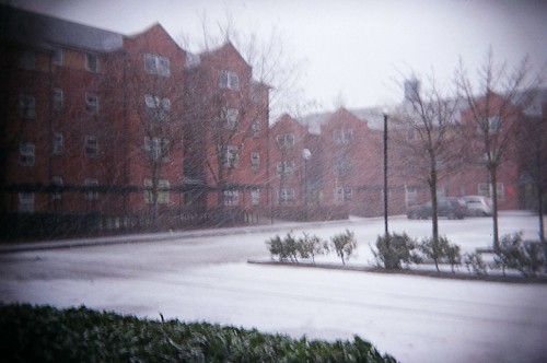
Friday 24 December 2010
Friday 10 December 2010
DP3 Evaluation

This is the homepage of my finished website.
Since I am totally new to building a website, I chose to basically stick with the original design. I used to same brown-creamy colour as it is the colour of chocolates. The banner is basically the same as it is their logo, but I rearranged the words and added a chocolate photo so it looks more interesting.
I redesigned the navigation bar to the left side because of the F shape concept. I think it's easier to find the navigations if the bar is vertical. I also grouped the Location and Contact Page from the original website into one Information page, so there isn't too many navigation to choose from and the users could find the same kind of information in the one page.
Originally, I have put a chocolate splash photo as the background picture, but because of the issue of different browser resolutions, I decided to put the picture under the footer so it stays in the same place all the time.
I have put some pictures using JQuery and JavaScript mouse-over in the website, as I think the interactivity makes the website more attractive and the chocolates more appealing. I have also created an entrance page with a chocolate splash as the background and a mouse-over picture as a welcoming sign. The reason I have created this page is because I could like the users to experience how it feels like to go in the shop with appetite for chocolates.
Thursday 9 December 2010
Interactive Music Video - mirror by SOUR
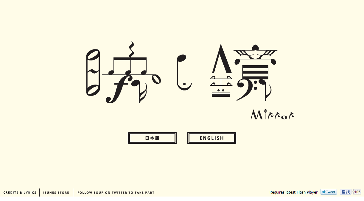
A Japanese music video called 「映し鏡」(mirror) by the band SOUR.
You need to have the latest version of Flash Player and it only works in the Safari or Google Chrome browser. Connect with Facebook/ Webcam / Twitter would be much more fun playing it.
I think it's an amazing idea of making an interactive music video like this. Very cool.
It feels like I am participating it in too. With the Google map and all that interactivity, I think it's really well done.Tuesday 30 November 2010
Web 2.0
From the article 25 Examples of Web 2.0 and Traditional Design Rules Coming Together, I've chosen this Viget Inspire website as I found it inspiring. It is a blog-based website from the designers of the web company Viget Labs.

I really like the colours and the watercolour theme and feel. It feels calm when I was looking through the site.
I like the header a lot, I think the word 'Inspire' associated with the rising sun worked really well. And I think it's clever that they have their name and logo look like the sun coming up, looks like its telling you there are inspiring things behind the website, you just have to dig them out.
The font looks professional and it works great with the overall design.
I love their avatar, I didn't even realized there is an avatar on each post until the article pointed out. They are so nicely done they don't distract you from reading the posts at all which, many other avatars do.
I find the boxes in the sidebar really cool, the design is unique and contemporary.
It has a lot of information on this website but they are very clear and the content is not just about their work or company, but they also "write about design news, trends, techniques, buildout, inspiration, CSS, and our project" from a more general angle.
The content in the sidebar is rich and very useful. The information is also really well organized.
The site hasn't been changed since 2009, I think it's because the website works well and it's probably representative for them. It looks professional yet interesting for people to look at.
I would very much like to create my own avatar as clever as theirs. And I wish I could make a website which is clear and easy to use but yet content-driven too.
Monday 29 November 2010
Adit Shukla
I just thought this web designer Adit Shukla's portfolio website is so wise that I need to put it up here.

I find the header and the sidebar work together really well and the idea is really clever. I think the choice of colour is quite daring but it works out quite well. Although this is a simple website with not much content, the design of the website is really clever.
I find the header and the sidebar work together really well and the idea is really clever. I think the choice of colour is quite daring but it works out quite well. Although this is a simple website with not much content, the design of the website is really clever.
Wednesday 24 November 2010
Photo Donuts
So I found this website called Photo Donuts from my previous art teacher's twitter (That's when I feel twitter and my network useful).

It is a photography website with different photographers presenting everyday. They are different in style and they are from all over the world. It has some inspiring photos and I think the website itself is quite nice too. It has a clear layout and instructions, I like the home page where its like a portfolio page with the daily photographers photos.
Friday 19 November 2010
Colour in Design
I think the colours of this logo indicate the elements of a cup of coffee.
Blue for water, Brown and Black for coffee beans.
As I thought of Cafe Nero I thought of Starbucks too, so I did an exchange of colours of these two logos.
The Original Logo

reminds me of trees...

christmas tree?

snow on a tree? :p

feels like it's a scary little coffee shop

I think they uses green is because they wanted to show their coffee beans are organic. I don't know about the mermaid, maybe it represents the sea? but what's the sea to do with coffee..........who knows!
The Original Logo
Don't know why but it looks like it's a dairy company...
same reason, it's the colours of cooffee beans, water and milk
This actually reminds me of a cup of latte...
Wednesday 17 November 2010
Shigeo Fukuda
When I looked at the Design Is History website, Shigeo Fukuda immediately caught my attention - a graphic designer which I had came across briefly before.
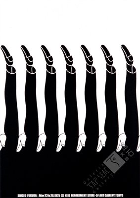
1979 Fukuda Illustration Exhibition Keio Gallery, Tokyo
Shigeo Fukuda is a Japanese graphic designer, famous for poster designing. His work is simple but yet effective. He then created illusion illustrations which I found really interesting too. His works are rational reflective rather than commercial, like his most famous work Victory 1945, an ironic illustration of the war.
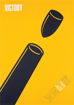
1975 Victory Poland Poster Museum
He is good at communication therefore had created impacted works using simple illustrations. A lot of his works look simple and easy to understand but yet have complex meanings in them. His works shown concerns about social, cultural and environmental issues if the time. I like his works as they are inspiring and his style of design is so unique and thought provoking.
“I believe that in design, 30 percent dignity, 20 percent beauty and 50 percent absurdity are necessary"
"In terms of my graphic design, I feel visual communication is the most important element.
by Shigeo Fukuda
Friday 29 October 2010
wireframe
I have decided to do my 'Retail Space Website' on this chocolate shop called Chocolate Utopia in Nottingham. There are the wireframes I've created for the website.


The design is very simple and hopefully easy to use. I think I will basically stick with its original website for the content.


The design is very simple and hopefully easy to use. I think I will basically stick with its original website for the content.
Friday 22 October 2010
Illusions
As we were talking about senses in the seminar yesterday, it reminded me the TV program called "Horizon" I was watching on Monday on BBC 2.
Is Seeing Believing? Interactive Experience

I found it interesting when I think about how our senses work after watching this program. Our senses work separately yet together to enable us to define information we receive. The ways we think, reason and act can be changed by different senses. And I think this could be applied to our multimedia field too. I believe in the future time, there will be more 3D devices within our lives, products like 3D computers and mobiles, and maybe 3D glasses are no longer needed for seeing 3D images or movies. Maybe even 4D products is coming, with our senses like smelling food from a movie?

Because our senses work together, although visual design is the most important element in web design, sound effect plays an major part too. If the right sound/music is playing, they can add effective impact to the audience while they are looking through a website. It keeps the audience's attention on the site and maybe concentration too.
Since scientists are working on developing a new sense on human body, I believe there are a lot more interactivity will be developed with the multimedia industry in the future as well.
Thursday 21 October 2010
We Think
Charles Leadbeater - We Think
I think this is indeed true. I agree with what its saying in the video.
"Information is everywhere", and to me, the web is like a massive brain which stores information from everyone (who's willing to share their information of course) and everywhere.
"New ideas usually come through conversations" and because "More ideas being shared by more people than ever", it leads to mass innovation.
"Mass innovation comes from communities"
"It's like building a bird's nest, where everyone leaves their piece", just like people from different communities sharing/leaving information and ideas on the web which motivate innovation and creativity.
"That should be good for - Democracy because more people will have a voice; -equality because knowledge can be set free to help people who need it"
Yet country like China who has approx. 298 million people have internet access do not have the right to speak even on the web. They have lots of online media restrictions and many of those famed media sites such as Youtube and Facebook are blocked from the government.
Also,
"How do we protect what is private?"
"Are we always safe sharing?"
"How do we earn a living when everyone is freely sharing their ideas?"
So, What do We Think. What do You Think?
Thursday 14 October 2010

website reviews
1) Roth Aniko - http://www.rothaniko.hu/

This is a website of an artist called Roth Aniko from Hungary. Her illustrated-style is strongly presented within the website. I like that she combines her own face with the illustration on the front page, it makes people remember who she is. And along with the colour and the font, it makes people feel looking at this website is going to be interesting and joyful.

The layout is quite clear when you go in to the website, I could say it's user-friendly in terms of the interaction design. I really like the 'ship-carriage' and the balloons and even the fish because it flee when you click it. I also think the way that you can pick at the thumbnail of her works is effective as a work display, and when you enlarge it, there are 2 'angels' on the top which make the whole display more elegant.
I don't really like the font when I was looking at the info bit, as some of the words were not very clear because of the font. But overall I found the font and the website's style matches really well.
2) The Egg Republic - http://www.theeggrepublic.com/

The Egg Republic is an agency which specialized in 3D animation, branding and interactive works based in New York. The website itself is very computer game alike. The little robot is like controlling the screen and I like it acts like a human too. There is a little helicopter flying in the home page and when you poke it, it disappear like it had been shot by guns which I found it quite interesting.

You can pick on the works they produced and also pick the ones at the back like a pile of folder, the way that the information presented was like in a computer game too, where it appears like typing in the computer. It's also really cool that the links are all connected like a runway and I think it represented the meaning of transporting information well. The whole website is very 3D based, you can tilt around the works, which is fascinated but I found it hard to handle after times as it keeps moving when I tried to read the text.
3) Earth Pilgrim - http://www.sachabiyan.com/

This is a website of a photographer called Sacha Biyan. This website is very simple and clear, very easy to use and very understandable. No fancy fonts or designs. The website is based on grey and brown which echoes with his works really well as most of his photos are black and white. And so is the calming background music.

I think the layout of the website looks like a book which makes his journal and photos even more professional and serious. Also in contrast of the clean design, his works look appealing and fascinated. This simple design gives people an image of a composed person which I think suits Biyan as he had travel around the earth and has a lot of different and precious experiences. It's kind of a reflection on his website and works.
Summary of Complete Beginners Guide To Interaction Design
"Interaction Design bridges the gap between man and machine"
http://www.uxbooth.com/blog/complete-beginners-guide-to-interaction-design/
This article basically tells you the basic info of interaction design and a few things interaction designers should be aware of and what they should do while designing.
Interactive design hasn't got a long history and it's all about the interaction between users and machines.
5 concepts of IxD
- Goal-Driven Design - It is essential to know what the users' goals are before designing. And this is the constraints designers have, which need to be considered in order to meet the users' needs.
- "Interface As Magic" - The best interaction designs should be simple, easy and unnoticeable, because users don't necessarily think of the interfaces when using the website.
- Usability - Should be easy to use and understand in order to give users to get what they want easily.
- Affordances - The functionality behind a website or service gives the best interaction designs. It should look like what it is.
- Learnability - Familiar components are important for a usable interface, and interaction designers should make interface learnable.
- From/inform a design strategy - Designers need to know who she's designing for and what their goals are in order to design a usable interaction.
- Identify and wireframe key interactions - Design and sketch out the interactions wanted.
- Prototype interactions - might include XHTML/CSS, prototypes, and paper prototypes.
- Stay current - Keep explore new interactions from the web. Be aware of the industry.
Monday 11 October 2010
My portrait
This is the first time I play this game, and it's actually fun:)

We can play it online and send it to other friends, see if it come out as an interesting monster:P
http://www.drawandfoldover.com/
And this is actually a very good flash website itself too.

We can play it online and send it to other friends, see if it come out as an interesting monster:P
http://www.drawandfoldover.com/
And this is actually a very good flash website itself too.
Sunday 10 October 2010
useful websites
One of the good points of using twitter is I got to know some interesting and useful websites from other people from the industry
Here are some I looked at recently:
Here are some I looked at recently:
- 17 Websites that all web designers and developers should know http://veryinspirational.com/blog/web-design-blog/2010/10/06/17-websites-that-all-web-designers-and-developers-should-know/
- 50+ Beautiful Flash Websites for Your Inspiration http://www.hongkiat.com/blog/beautiful-flash-websites-for-your-inspiration/
- 40 Must See Cool Short Animation Websites http://dzineblog.com/2010/09/40-must-see-cool-short-animation-websites.html
Tuesday 7 September 2010
Holga 135
Second roll of my Holga 135 camera.
Photos through out my first year uni life, from Dec 2009 to Jul 2010.
http://www.flickr.com/photos/salome_liu/sets/72157624351781883/
I am getting use to this camera now. This second roll came out better than I thought which I was quite satisfied.
Photos through out my first year uni life, from Dec 2009 to Jul 2010.
http://www.flickr.com/photos/salome_liu/sets/72157624351781883/
I am getting use to this camera now. This second roll came out better than I thought which I was quite satisfied.
Saturday 22 May 2010
Nove Drink Advert
Can't find it on youtube. Click the link if you can't see:-
http://v.youku.com/v_show/id_XMTc0NDU3ODg4.html
very cool pixilation.
I wonder how did they do the street graffiti thing. Use a desolated area or something?
Tuesday 18 May 2010
DP2 Moving Images - Film Ambient Vapour
Our film is finally done!
Ambient Vapour
I am quite pleased with it. As it is our first "professionally-done film", I would say it worked quite well.
There were a few feedback last seminar about our film that could be improved-
Ambient Vapour
I am quite pleased with it. As it is our first "professionally-done film", I would say it worked quite well.
There were a few feedback last seminar about our film that could be improved-
- Too many zoom in's-
Some of the zooming in was meaningless, it's not necessarily needed,
Zoom in shots should be done in 3 separate shots instead of 1 continuous zoomed in shot, so the scene could be clearer
- The audio was good, but Jools suggested us to put the mystery music in some other part of the film as well, so the mystery feel continues as the film goes along.
- Repeated some scenes, as the film was inverse, repeat some scene will make the film clearer and makes more sense
Wednesday 5 May 2010


Friday 30 April 2010
Filming Ideas
We had a lot of ideas on how our scenes should be filmed, and how the new scene is going to work.
We liked this 2 things happening in 1 scene idea from the film '500 days of summer'
so we decided to use this idea for our new scene.
Hope it work well in our film.
We liked this 2 things happening in 1 scene idea from the film '500 days of summer'
so we decided to use this idea for our new scene.
Hope it work well in our film.
Saturday 24 April 2010
Design Practice 2 - Short Film
So we've started our last project of DP2 - Moving Images
Our group's script is called 'Ambient Vapour'
We think it is about some kind of addiction and the character of finding herself.
It's a mysterious story which we will leave a lot of spaces to the audience to think what the story is trying to say.
My role is the camera man. I haven't done any filming apart from the one we did in the first term, so hopefully my groupmate Vyte will help me along and we will make a great film.
We had a lecture on making storyboard and prepping the shoot yesterday.
Jools introduced us the production tools Celtx and FrameForge 3D. I found FrameForge very interesting and fun to use.
And as a camera man, I need to be very clear about the angles and shots of how each scene would be like, so we've discussed this yesterday and hopefully it will come out as we wanted it to be.
Thursday 15 April 2010
Web Designer - Nick La
so I've found this American illustrator and web designer Nick La along with his fascinating studio website and blog.
http://www.ndesign-studio.com - portfolio & blog of Nick La
http://www.webdesignerwall.com/ - a public blog of design ideas, web trends and tutorials
http://bestwebgallery.com/ - a gallery site full of range of web designs
http://icondock.com/ - collection of stock icons that you can buy for your own website
http://jobs.webdesignerwall.com/ - where you can find design jobs
Monday 22 March 2010
16/03 Context 1 Seminar - Interrogation
We split into groups and came up with some questions that could lead a person to talk about thier development.
- What have you done last week that reflect on your development?
Online journal, class work and the visual essay
- What sources have you used?
youtube, websites
- What issue/problem did you have?
The whole project is about problem solving
- How did you overcome the problems?
Same as above
- After looking at other people's work, how highly do you rate your development?
Not very high, makes me want to do more, feel a bit behind
It seems that msot people start off by researching on the internet. And I do agree that after I look at other people's work, I feel I need to do more, I want to push myself to improve on my development too.
Thursday 18 March 2010
Little bits and pieces for the visual essay
I think I will start off by telling what my pathway choice is.

Then show what I am interested in, which explain my choice


Practitioners
IMAGI STUDIOS

Frank Stella

Inspirations


The International Biennial of the poster in Mexico


Then show what I am interested in, which explain my choice


Practitioners
IMAGI STUDIOS

Frank Stella

Inspirations


The International Biennial of the poster in Mexico


Thursday 11 March 2010
Moving Flash
This is the first moving flash we have been tought
A bouncing basketball

http://salomeliu.deviantart.com/art/trial-quiz-156914569
and my little mario using sprite sheet

http://www.swfcabin.com/open/1268327551
A simple quiz for practice

http://www.swfcabin.com/open/1268328827
A bouncing basketball

http://salomeliu.deviantart.com/art/trial-quiz-156914569
and my little mario using sprite sheet

http://www.swfcabin.com/open/1268327551
A simple quiz for practice

http://www.swfcabin.com/open/1268328827
Subscribe to:
Posts (Atom)